Soultrip
Soultrip is "middle Tennessee's premier soul cover band", whose goal is to take their listeners down memory lane with rock soul music of the past. Instead of lounge aesthetics, Soultrip infuses horns and backing vocals to add some flair.
The Wild Card
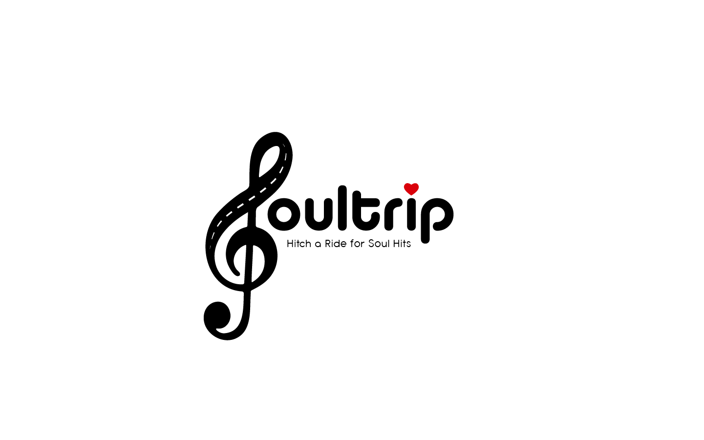
In order for this logo to scale beautifully both at large and small scale, I put all of the focus on the word mark, and brought in parts of the original that I felt represented the heart of the band; familiarity in the groovy typeface, a smooth scenic ride, and the love of music.
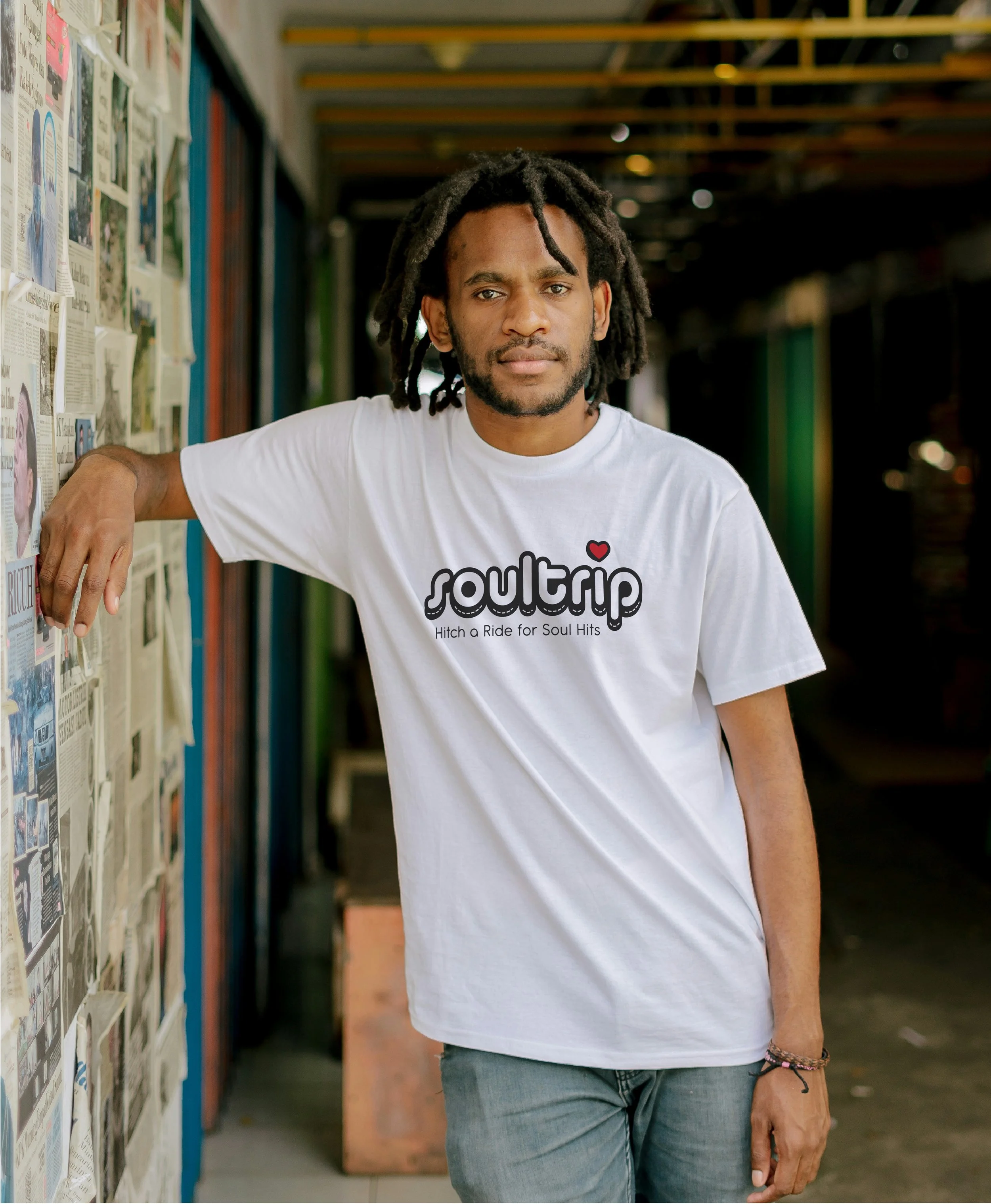
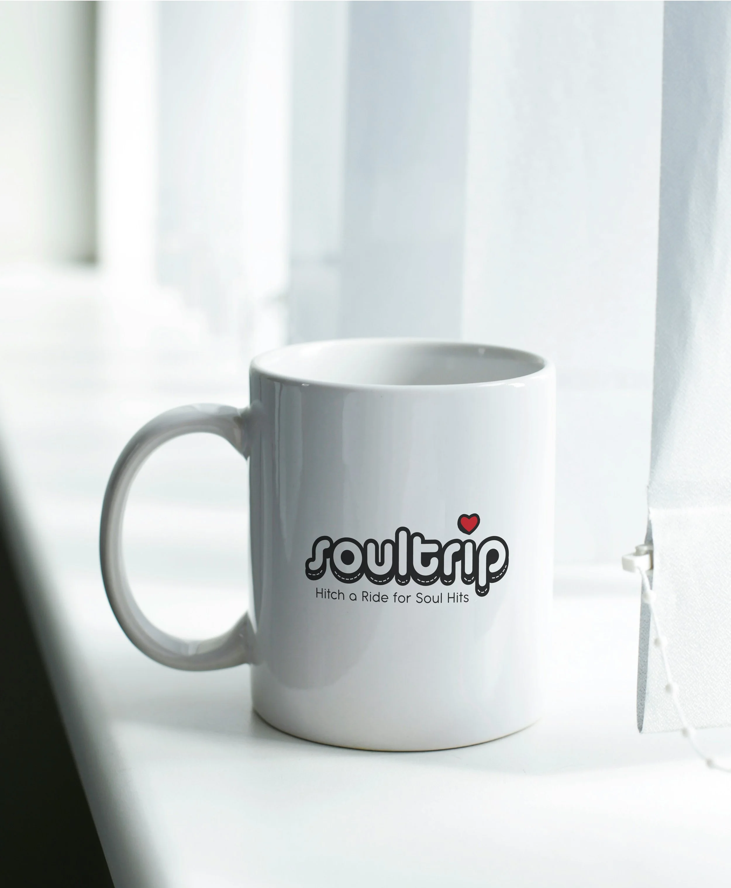
Wild Card Mocks




Then and Now
The client requested an editable, enhanced “replica”, of a logo he tossed together in Microsoft Word. It needed to work on a 24x36ft banner that would hang behind the band, various pieces of merchandise, a website, and as an email signature.
Maintaining elements from the client’s original concept:
Feeling of a carefree drive down a scenic winding road. Not just through the tagline, but overall, visually.
A groovy typeface.
The heart represents the love that a lot of folks feel for the rock soul community.
The treble cleft represents the music coming out of the band and audience alike.
In this version, we edited down the elements, and removed the gold color as it was drawing lots of attention, and straightened out the heart and the word mark for legibility.
Clients original mock up
Client’s preferred design

